
Start a project
UX · Brand · Photography · 2026
Troup's Pizza is a genuinely good neighborhood spot — lively, welcoming, and a little strange in the best way. The website wasn't any of those things. It felt generic, the menu was hard to scan on mobile, and Party on the Patio had almost no visibility despite being one of the restaurant's biggest draws. The digital experience and the in-person experience were two different places.
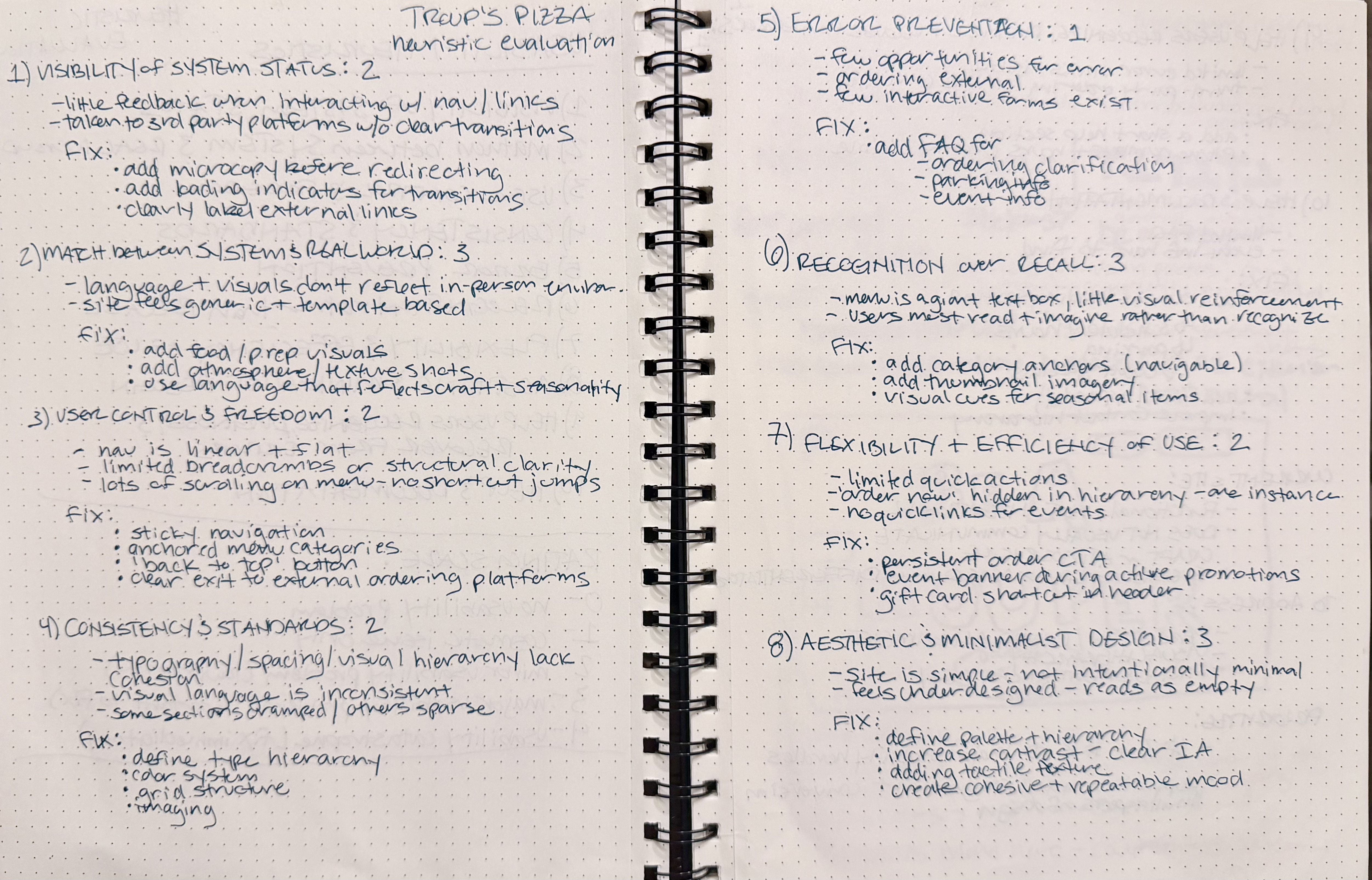
Before touching any layouts, I ran a heuristic evaluation of the existing site against Nielsen's usability principles. Three problems consistently arose: transitions to third-party ordering platforms lacked warning or context, the navigation hierarchy was shallow and hard to scan, and visual consistency was almost nonexistent across sections. The fix priorities wrote themselves — clearer navigation structure, stronger hierarchy, and a modal or redirect warning before users left the site entirely.
I explored two visual directions before committing. Warm & Eclectic leaned into natural light, shared dining scenes, and everyday texture — community-first, relaxed. Elevated & Local pushed harder on craft and credibility: dramatic lighting, close prep shots, deep neutrals with warm accents. Elevated & Local won because it gave the restaurant room to be taken seriously without losing its neighborhood approachability. It also gave the photography more to do.

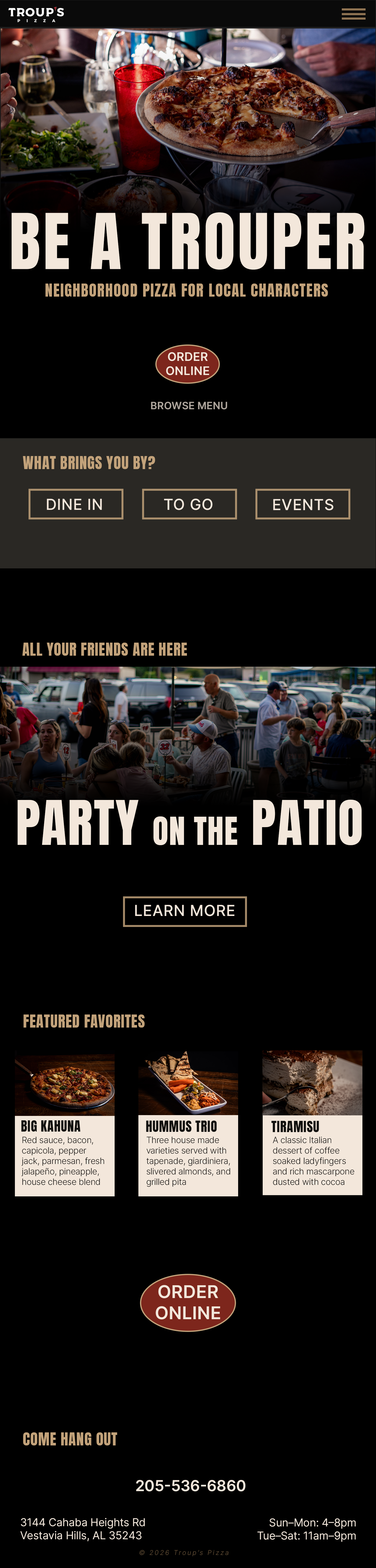
Wireframes focused on four priorities: a full-bleed hero that establishes brand tone immediately, a prominent ordering CTA that doesn't get buried, simplified navigation, and Party on the Patio surfaced higher in the homepage hierarchy based on direct stakeholder input. The menu page got jump links for category access — the original had no way to skip around a long scrolling list.
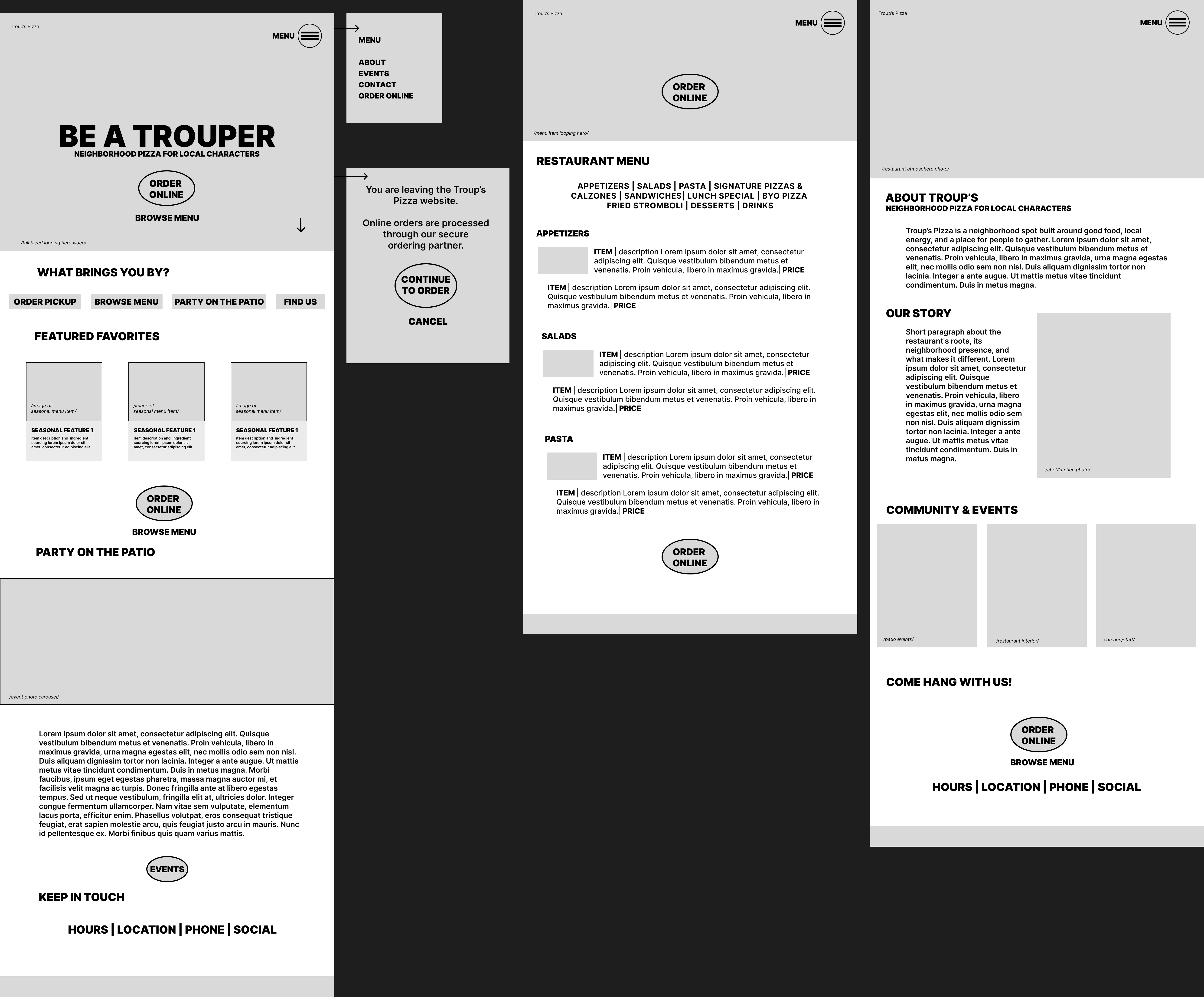
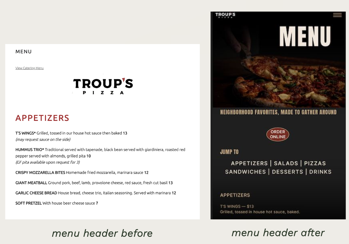
After peer review and a stakeholder check-in, one thing came back clearly: events matter more than the current site implies. Party on the Patio was the client's priority, and the original design buried it. I moved it up in the homepage hierarchy and made it a full visual section rather than a small link. The menu header also got a full rebuild — the before version was a plain text list, the after version uses the full brand treatment with the atmospheric photography.
Two mobile-first, high-fidelity screens: the homepage and the menu page. The homepage leads with the "Be a Trouper" hero, moves into intent-based navigation (Dine In / To Go / Events), surfaces Party on the Patio as a featured section, and closes with Featured Favorites and location info. The menu uses jump links, consistent category hierarchy, and CTAs placed at natural decision points.
The complete process documentation — including research, wireframe development, visual direction exploration, and final deliverables — is available as a recorded presentation and full PDF deck.
Download full process deck →Working with a real business changes everything. Stakeholder constraints aren't obstacles — they're part of the design brief. The clearest win was the photography: shooting on-site gave the redesign something a template refresh never could have. The biggest lesson was scope management.