
Start a project
UX · motion · landing page · 2025
Aesop's retail spaces are unmistakable. Stone, low light, the smell of incense, slow pacing built into the architecture. You don't browse Aesop the way you browse other beauty brands. You arrive. Their website doesn't carry that feeling, and probably can't, because most landing pages are built for efficiency, not for atmosphere. This concept asks a different question: what would it look like if the digital arrival functioned the same way the physical one does, as a deliberate threshold between everyday browsing and a more attentive state.
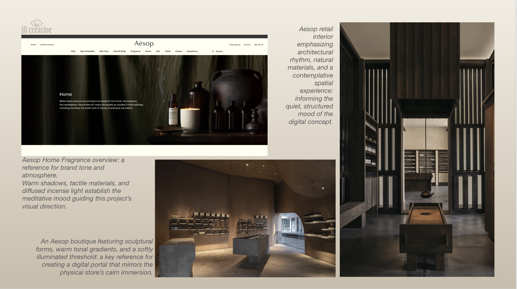
I spent time exploring Aesop's retail and digital spaces before designing anything. The retail interiors do something specific: warm tonal gradients, sculptural forms, and a softly illuminated entry that makes you slow down before you've consciously decided to. The website is clean and well-built, but treats the homepage as a product index. The opportunity wasn't to redesign Aesop's site. It was to imagine a layer that sits before it, an invitation, a quiet, intentional moment of arrival.
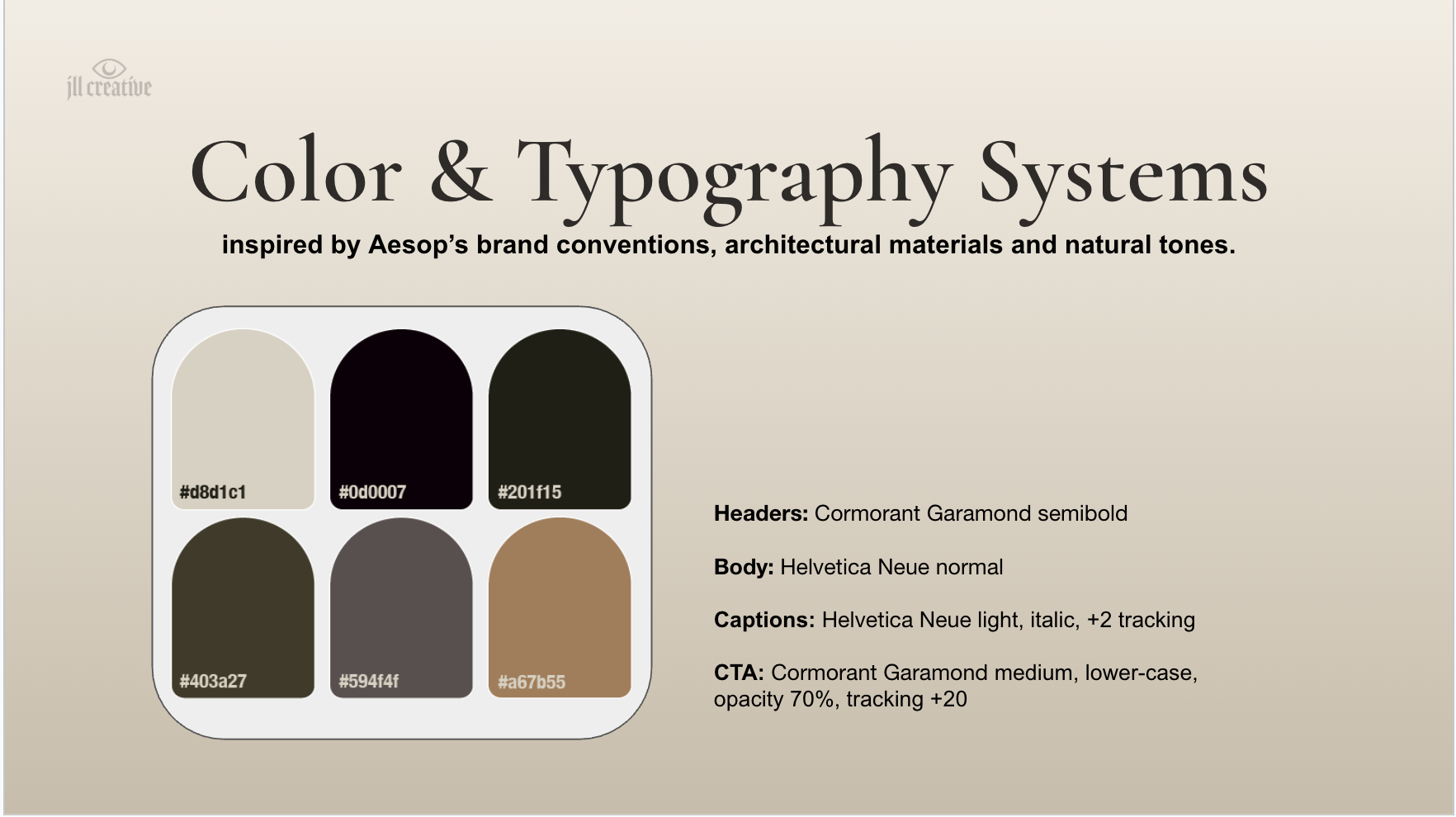
The visual system pulls directly from Aesop's existing brand conventions and architectural palette. Cormorant Garamond for headers, Helvetica Neue for body, reading restrained, editorial, contemplative. Color drawn from the architectural materials in their boutiques: stone neutrals, deep umbers, low-saturation greens. The CTA treatment is intentionally quiet, lowercase Garamond at 70% opacity, because shouting "Begin" would break the spell.
The portal is a single screen. An arched threshold, layered light and fog with subtle motion, a quiet welcome message, and one CTA: Begin. That's it. The restraint is intentional. The user lands, slows down, takes in the atmosphere for a beat, and only then enters the rest of the experience. Atmosphere isn't a substitute for usability; the UI elements stay legible, and the interaction is simple. But the pacing and consideration for end users' well-being are what change.
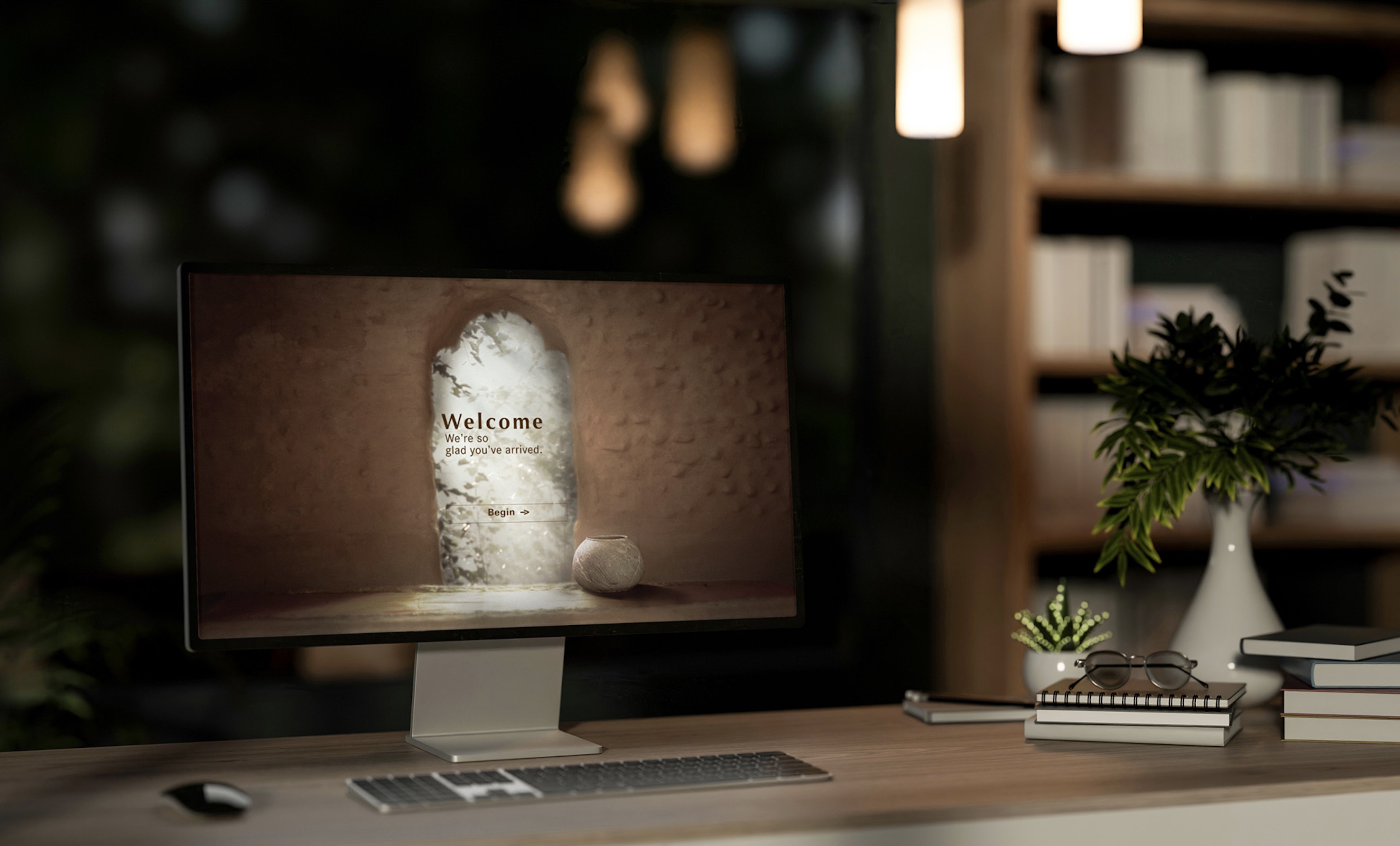
The portal works as a quiet, intentional threshold — shifting the user from passive browsing into a more focused, sensory state before they reach the rest of the site. It's a small gesture with a specific job: make the digital arrival feel as considered as the physical one. The project shows how UX strategy, visual storytelling, and spatial thinking can work together inside a single cohesive interface, even at a small scale.
This project pushed me on restraint. The instinct on a spec piece is to keep adding, prove range, show every move. The whole point of a threshold is that it earns its weight by doing one thing well. Cutting back to a single screen with one CTA was harder than building something more elaborate would have been. The motion version, built in After Effects, is where the pacing actually clicks. Timing has to be felt, not described, and seeing the threshold animate is what made the concept real.